“Color Speaks all Languages”
Colors in interior design have the power to lower or raise our heartbeat, trigger anxiety, boost mental health, impact our sleep, or even work performance. Taking into consideration gender, culture, values, geography, and other related influence factors, colors speak different languages.
The purpose of businesses is to offer a wonderful experience to their visitors and encourage them to return. In a restaurant, for instance, the food quality significantly impacts the customer’s impression of the business. However, the customer’s mind while visiting any space is just as important. An unhappy or dissatisfied mood can lead to a negative review. Businesses want their customers to leave satisfied and happy, not disappointed. That is why it is crucial for the interior designer in charge of planning the space of a hotel, restaurant, spa, hospital, or any other business to focus on the theme and the experience the place wants to convey and choose the appropriate colors accordingly.

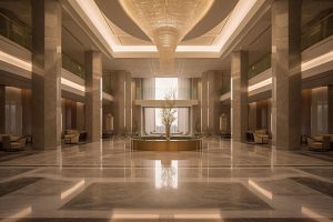
In Middle Eastern interior design, colors play a crucial role in creating a rich and vibrant aesthetic that reflects the region’s cultural and historical influences. Earthy tones such as warm terracottas, deep browns, and sandy beiges are often used to evoke a sense of warmth and connection to the desert landscape. Jewel tones like emerald green, sapphire blue, and ruby red are prevalent, adding richness and a touch of luxury to spaces. These colors are frequently incorporated into patterns and designs, drawing inspiration from traditional Middle Eastern textiles and geometric motifs. Additionally, metallic accents in gold and brass are popular for their ability to enhance the overall sense of luxury and sophistication. The use of colors in Middle Eastern interior design goes beyond mere aesthetics, reflecting a harmonious blend of tradition and modernity.
The Color Psychology
Color psychology is the theory of how different colors can influence human emotions, behavior, and perceptions. It explores the psychological and emotional effects that specific colors have on individuals. While responses to colors can be somewhat subjective and influenced by personal experiences and cultural factors, there are general associations and patterns in how colors are perceived.
Color Psychology Matters in Interiors
Color is another indispensable element that elevates or diminishes an interior design scheme. Its contributions to the overall aesthetic are pivotal:
- Mood Crafting: Colors wield profound psychological influence, evoking emotions and establishing the mood of a space. Warm hues, like reds and yellows, infuse a room with energy and vivacity, whereas cooler tones, such as blues and greens, promote tranquility and relaxation.
- Visual Intrigue: A well-considered color palette adds depth and visual interest to a room. Diverse shades and tones create contrasts and focal points, enlivening the space.
- Spatial Perception: Color can manipulate our perception of space. Lighter colors have an expansive effect, making a room appear larger, while darker hues cocoon it in a sense of coziness and intimacy.
- Personal Expression: Color serves as a potent avenue for personal expression. Homeowners can use it to exhibit their personalities and styles, whether through bold accent walls or subtle, harmonious color schemes—rendering spaces uniquely their own.
- Balance and Harmony: Interior designers employ color theory to cultivate balance and harmony within a space. A well-balanced color scheme can unite disparate elements in a room, from furnishings to accessories.
Colors with Purpose
WHITE
The color white is associated with Peace and Tranquility.

Neutral colors are a great choice for creating a versatile and timeless look. They can help to create a sense of calmness and simplicity, which makes them ideal for creating a subtle background that allows other colors and elements to stand out. Neutral colors are often used in modern and minimalist interior design.
Consider white for your:
Kitchen, Bathroom, Bedroom, Dining room, Nursery, Libraries
Emotions associated with the color are:
Peace, Harmony, Hope, Innocence, Minimal, Purity, Modern, Elegance, Luxury, etc.
GREY
The color grey is associated with Elegance and Style.

The color grey is considered neutral and can be used as a versatile canvas that allows other colors to pop or offers a calming, muted background. It is also an excellent choice for creating a cohesive design as it pairs well with many other colors and styles.
Consider grey for your:
Bedroom, Living room, Dining, Bathroom, Outdoor spaces.
Emotions associated with the color are:
Style, Elegance, Sophistication, Stability, Balance, Calm, Minimal, etc.
BLACK
The color black is associated with Modernism and Classy.

Black is a bold and impactful color that can bring an air of sophistication and a feeling of refinement to a room. When used in moderation, it can create a sense of depth and contrast, adding visual interest to any space. However, if used excessively, it can make a room feel gloomy and oppressive.
Consider black for your:
Bedroom, Kitchen, Entertainment room, Bar Room, Dressing Area
Emotions associated with the color are:
Versatility, Elegance, Luxury, Mystery, Power, Sophistication, Dramatic, Glamour etc.
BLUE
Blue is associated with Calm and Peace.

It’s often used in bedrooms and bathrooms to create a relaxing atmosphere. Light blues can make a room feel more open and spacious, while darker blues can add a sense of coziness. Light blue or shades of blue are also recommended for office spaces, allowing employees to concentrate while boosting work performance due to the balanced color.
Studies showed that this color lowers blood pressure and heart rate. It is also the most productive color. Blue is an excellent choice for offices, bedrooms, or even spas to keep visitors calm and relaxed.
Consider blue for your:
Offices, Playroom, Bedroom, Bathroom, Library
Emotions associated with the color are:
Tranquility, Serenity, Softness, Trust, Health, Healing, Patience etc.
GREEN
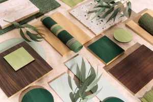
Green is associated with Nature and Health.

Studies have found that incorporating nature’s color or biophilic interiors helps in reducing stress, improving mood and well-being, reducing mental fatigue, and increasing focus and concentration.
Please read our article on Biophilic Interiors- The Path to Sustainability- Crafting Green Interiors
Consider green for your:
Bedroom, Office Space, Living Area, Spa
Emotions associated with the color are:
Freshness, Growth, Joy, Kindness, Luck, Balance, Harmony, Healing, Comfort etc.
BROWN
Brown is associated with Resilience and Security.

Brown is a popular color in interior design as it creates a warm and cozy environment. Lighter shades of brown like beige, can make a room feel comfortable and inviting. It’s a common choice for living rooms and bedrooms where one desires a sense of relaxation and comfort.
Brown is often associated with wood and leather finishes, which can be used in a variety of areas such as ceilings, flooring, walls, and furnishings. By incorporating wood and other natural materials, we can create an organic, modern, and sophisticated environment in our clients’ spaces.
Consider green for your:
Reception Areas, Bedroom, Office Space, Living Area, Spa
Emotions associated with the color are:
Comfortable, Organic, Friendly, Strength, Stability, Warmth, Power, Sophistication etc.
PURPLE
Purple is associated with Elegance and Royalty.

Purple is a luxurious color that can create a sense of royalty while promoting creativity. Lighter shades can evoke calmness, while darker shades can create a sense of drama in a space.
Consider purple for your:
Foyer, Dressing room or walk-in closet, Kitchen, Living room.
Emotions associated with the color are:
Luxury, Richness, Sophistication, Excitement, Calmness, Relaxation etc.
YELLOW
Yellow is associated with Light and Happiness.

Yellow is a vibrant and lively color that is often associated with joy, positivity, and warmth. It can spark creativity and promote concentration. Yellow is an excellent option for kitchens, dining areas, and entryways. When paired with gray or white, yellow can add a touch of sophistication to interior design. On the other hand, when you pair yellow with contrasting colors such as dark purple or red, it will provide you with a vibrant dynamic lively look.
Yellow can also increase metabolism and give energy. It is a smart choice to use this color in the breakfast areas in a restaurant or hotel.
Consider yellow for your:
Restaurants, Dinning Area, Playroom
Emotions associated with the color are:
Care, Happiness, Joy, Intelligence, Excellence, Productivity, Energy, Nature (Sunshine) etc.
RED
Red is associated with Love, Desire, and Passion.

Red is a vibrant and energetic color that can stimulate the senses. It is commonly associated with passion, love, and excitement. In the field of interior design, red can be used to create a dynamic and lively atmosphere. Because red has such depth, it is often used as an accent color in textiles or furniture. However, it is important to use it sparingly as an excessive amount of red may become overwhelming.
Red, as opposed to blue, raises the heart rate and blood pressure. This color is known to stimulate emotions and energy and to promote appetite making it a great choice for restaurants.
Consider red for your:
Creative spaces, Living room, Bedroom, Kitchen
Emotions associated with the color are:
Love, Passion, Desire, Sensitivity, Energy, Power, Strength, Determination, Leadership, Courage, willpower, Anger, Rage, etc.
It’s crucial to remember that people may perceive colors differently and cultural backgrounds can also affect how they interpret colors. When we design an interior space, we consider the comfort and preferences of our clients. By using a combination of colors and understanding the psychology of colors, you can create a welcoming and harmonious environment.
Ever walked into a room and felt an instant sense of harmony and balance? Chances are, the 60-30-10 rule was at play! If you’re curious about the secret behind captivating interior spaces, it’s time to dive into color proportionality.
The 60-30-10 Rule in Interior Design
It’s a tried-and-true formula that interior designers swear by to achieve that perfect color harmony:
- 60% Dominant Color: This forms the backdrop of your space. Think of walls, large furniture pieces, or flooring. It sets the stage and lays the foundation for your design.
- 30% Secondary Color: This is the supporting actor in your design. It complements the dominant color and typically appears on upholstery, curtains, or accent walls.
- 10% Accent Color: This is where the magic happens! This small but mighty percentage is reserved for eye-catching pops of color – think throw pillows, artwork, or decorative accessories. It adds vibrancy and personality to your space.


Why Does it Matter?
- Visual Harmony: The 60-30-10 rule ensures a balanced visual composition, making your space feel cohesive and well put together.
- Focal Points: It directs attention to specific areas or elements in the room, creating focal points that draw the eye.
- Emotional Impact: The right color scheme can set the mood – from cozy and intimate to lively and energetic.
- Personalization: Tailor your space to reflect your unique style while maintaining a sense of order and balance.
So, whether you’re revamping your living room, sprucing up your office, or just looking to enhance your interior design knowledge, give the 60-30-10 rule a try. It’s a simple yet effective way to transform any space into a harmonious and visually stunning environment.
Color psychology is a growing field in interior design, with a lot left to explore and learn. However, by following the basic guidelines provided in this blog, you can easily understand how to work with different colors to create an impactful interior design for your commercial property. The appropriate color scheme can make a significant difference in the lives of the occupants, whether it’s a residential space, office, or commercial property.
As an interior designer, it’s crucial to have a good understanding of the psychology of colors. It’s worth noting that the psychological effects of color can vary from one place to another around the world.